Mindbloom
MENTAL HEALTH SERVICE PLATFORM
Refining the new client activation workflow for Mindbloom’s mobile experience.
2024
OVERVIEW
Mindbloom is an online psychedelic therapy platform providing clinician-prescribed ketamine treatment within a structured, guided program. The onboarding journey was both clinically rigorous and operationally complex. To meet regulatory requirements and ensure patient safety, clients were required to:
Complete a comprehensive medical and psychological intake
Attend a consultation with a licensed clinician for prescription approval
Schedule and connect with a dedicated Mindbloom Guide
Prepare for and complete their first guided therapy session with their guide
After these milestones a client was considered “activated.” Without successful activation, patients could not access treatment, and the likelihood of program completion dropped significantly. The challenge was to design a mobile experience that reduced friction without compromising regulatory compliance, clinical integrity, or emotional readiness. I focused on clarifying the path to activation, reducing cognitive load, and increasing momentum across handoffs between medical approval, coaching, and session preparation. The result was a more coherent, confidence-building experience that supported both conversion and therapeutic outcomes.
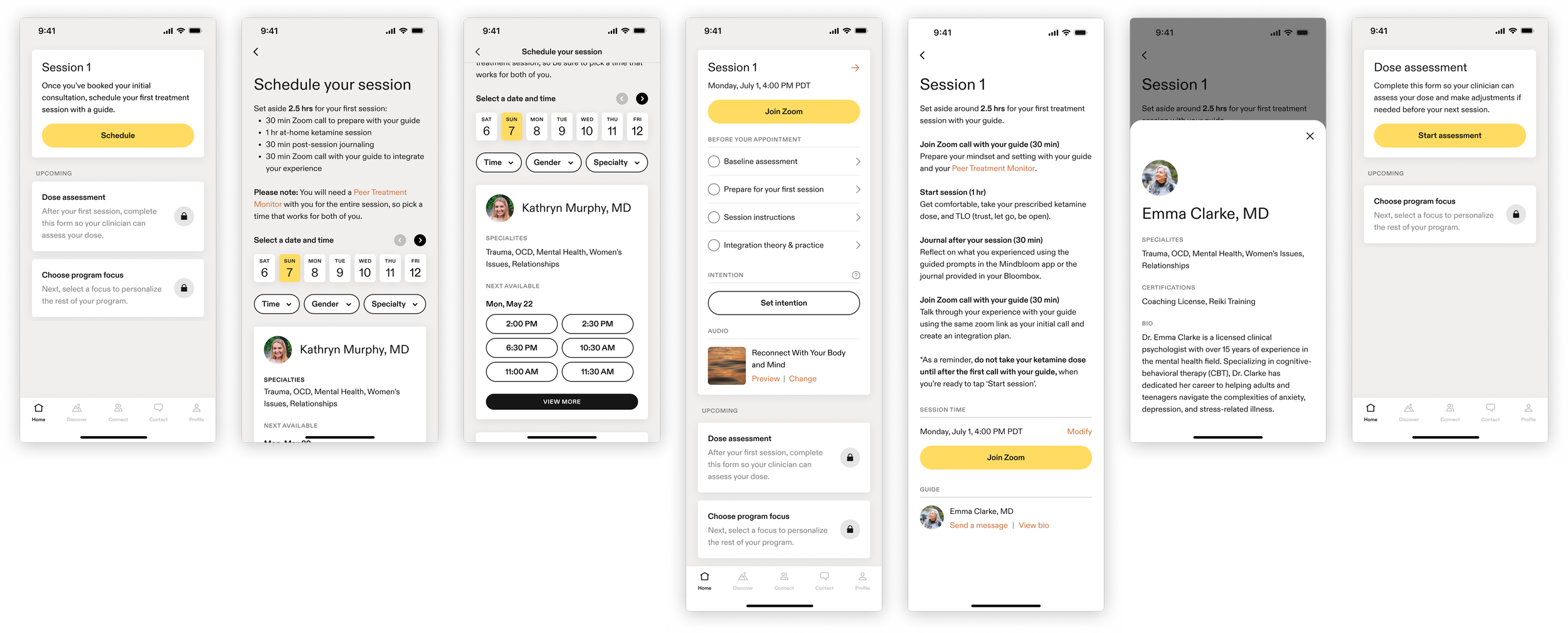
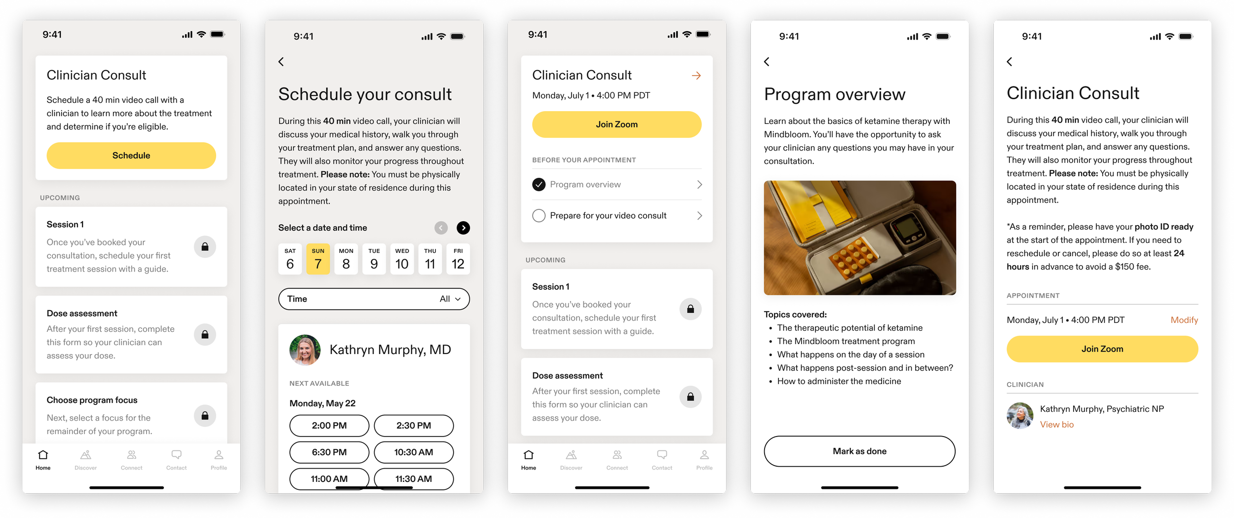
The Home tab was designed to function as a chronological timeline of required tasks, guiding clients step-by-step through activation. In practice, however, multiple task cards often appeared active simultaneously. This diluted hierarchy and obscured sequence, making it unclear what required immediate attention versus what was upcoming. Instead of reinforcing momentum through a structured progression, the interface introduced ambiguity at a moment when clarity and reassurance were critical.
Working within the constraint of preserving the existing structural framework of the Home tab (cards, drill-ins, and overall layout), the following design updates were implemented:
Single active focus state: The Home tab now surfaces one clearly defined “active” card at a time. Prior steps remain visible for context, but access is gated appropriately based on the user’s current stage in the flow. This restores hierarchy and reinforces sequence.
Dynamic progression logic: The Home tab updates dynamically as users complete onboarding milestones and transition into the treatment program, maintaining continuity and forward momentum.
Clearer hierarchy and status indicators: Visual states (e.g., active, upcoming, completed) were standardized to reduce ambiguity and make progression scannable at a glance.
Improved clarity in UI, visuals, and copy: Terminology, instructional language, and supporting visuals were revised for consistency across touchpoints, reducing cognitive load and aligning with updated design patterns.
Time expectation guidance: Key steps now include clearer guidance around duration, preparation requirements, and ideal spacing between milestones to set realistic expectations.
Shipment visibility: Shipment tracking information was surfaced earlier in the activation flow to ensure clients receive and confirm required materials before beginning their first session.
Reduced hidden content risk: Critical information previously buried in drill-in screens was surfaced or signposted more clearly to prevent unintentional oversight.
ROLES & CONTRIBUTIONS
As the sole in-house Experience Designer, I led the activation workflow refinement and coordinated closely with strategic and implementation partners across the organization.
My contributions included:
Conducted a UX audit of the existing onboarding and activation experience to identify friction points and opportunities for improvement.
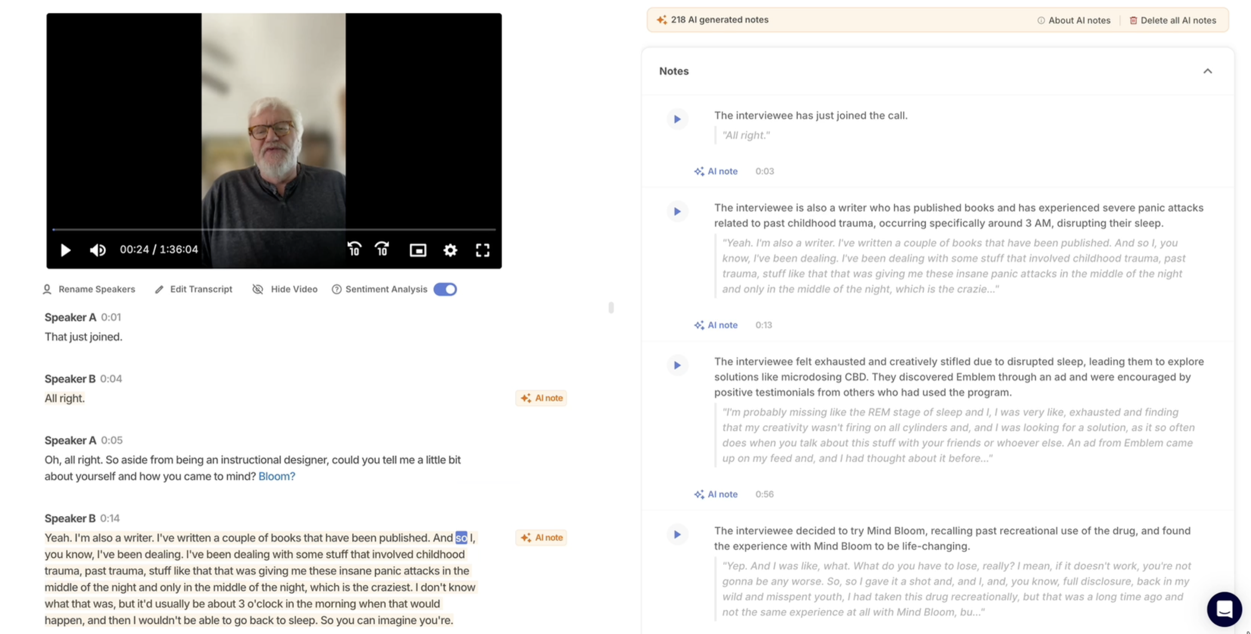
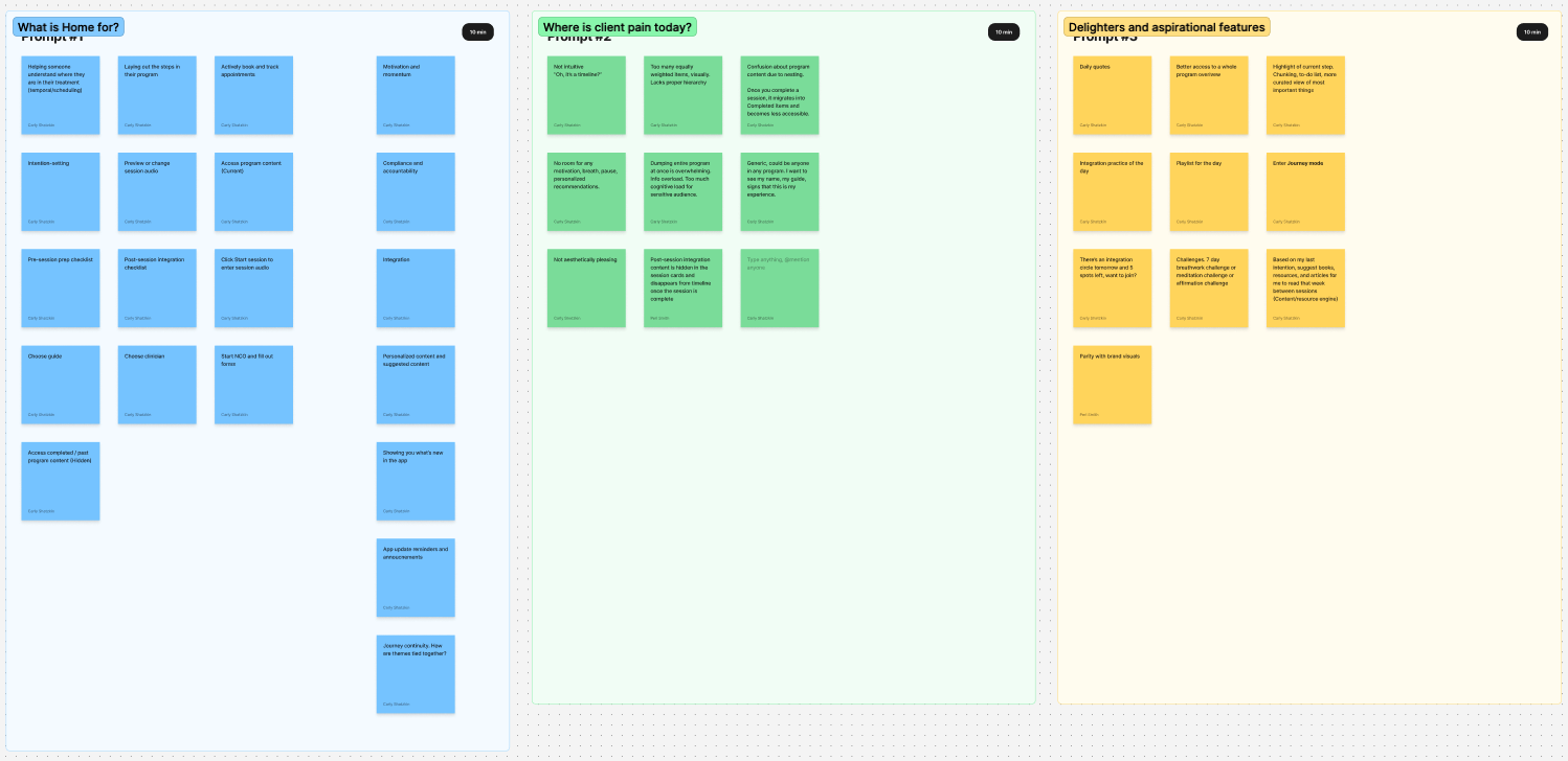
Led UX research interviews and synthesized findings into clear insights to inform design direction and prioritization.
Partnered with Product, Engineering, Marketing, and Leadership stakeholders to align on requirements, constraints, and rollout strategy.
Created a structured, trackable design handoff and QA process to support implementation clarity and reduce execution gaps.
Prioritized and managed design tasks across myself and a senior design contractor to maintain momentum and delivery quality.
Maintained and evolved the design system to support new patterns while ensuring consistency across the product.
Designed new UI elements and refined existing components to improve usability, clarity, and activation flow continuity.
EXPERIENCE AUDIT
I conducted and documented a comprehensive end-to-end experience audit of the activation journey. I presented findings to cross-functional stakeholders and outlined the highest-leverage opportunities for improvement. Together, we scoped and prioritized initiatives based on client impact and clear, low-effort wins. The audit surfaced significant inconsistencies across user touchpoints — including email communications, push notifications, mobile flows, web surfaces, and messaging from Mindbloom Guides and Clinicians. Legacy design patterns and terminology had been layered onto newer sequences over time, resulting in a fragmented experience. Given the inherent length and regulatory complexity of the onboarding journey, this lack of cohesion amplified cognitive load. What should have felt guided and supportive instead risked feeling disjointed, confusing, and at times overwhelming.
USER RESEARCH
Video interviews were conducted with clients at various stages of the activation process. Findings were consolidated into the following key pain points:
Clients did not recognize that the Home tab represented a sequence of required tasks.
Too many tasks appeared active at once, without sufficient visual hierarchy — creating confusion and overwhelm that sometimes led to app abandonment.
Clients lacked clarity around expected time commitments and the ideal spacing between appointments and preparation steps.
Critical information was buried within drill-in screens, resulting in some clients missing important content entirely.


